The Art of a Personal Website
When I first started studying computer science, I felt as if a personal website was for web developers. That wasn’t me, I wasn’t about to devote my life to Ruby on Rails, so I left it at that. About a year later, I started college and realized it’s more than that. Your personal website is far more than a showcase that you can program a website: in fact, my website is made using Jekyll, so all it’s showing is html, css, and a tiny bit of Javascript. Nobody really cares that I can write some mean html.
My website uses a very simple system: about once or twice a year, I’ll remake it. This may be making it using a different framework, like switching from Rails to Jekyll, or it may just be a visual overhaul. Each iteration I simply change the repository name to personal_site_x, where x is just the number of my current iteration. I didn’t expect that to go on for more than 2 or 3 times, but I’m now at 4, and definitely looking to keep the trend going.
The variations are not simply because I stop liking the website. The variations in my website come about by the understanding that my website isn’t just a branding tool, nor a display of my development prowess. In fact, those are some of the last things I want to show off with my website - I find portfolio sites to be bland, entirely free from personality. As a developer we have the freedom to push far beyond this, making a website that creates a timeline. The website is not the important part; the timeline is what’s important.
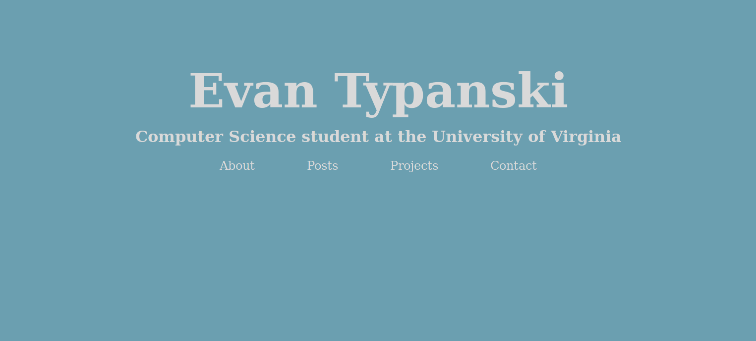
 Homepage of iteration 1 of my personal website:
 personal_site_1
The development timeline in a personal website is a simple display of what you’ve become as a developer. For example, the first iteration of my website was in Rails, when I was very much trying to learn as many skills as possible. Now, my website uses Jekyll, showing a maturity where I don’t need to use an overkill solution in order to fulfill my desires to learn new skills. My first website in Jekyll used bootstrap, had pretty bad UX, and was bloated just in the html. My current version uses css grid, better programming practices, and a lot more useful technologies in order to achieve a similar goal. Each step shows an increase in maturity - it may not affect the end user very much, like the switch from Rails to Jekyll, but it’s a way to see myself in the past.
A timeline then becomes a sandbox with each iteration. Your personal website is where you have the most freedom as a developer; the greatest ability to do whatever you want. I didn’t get this at first. My first iteration was a shot at being noticed by employers - what first years had decent personal websites at UVA, much less using a powerful web framework like Rails? Well, not many, and it may have helped land an internship, but it really didn’t get me much more from there. What the website became was a way to see a new website and say, “Wow, I really want to do something like that!” So, I did. That keeps happening, and it should never be stopped. My website is the sandbox that I can create something just because I thought it’d be cool to build. It’s one of few places I can create that content and push it out for the public eye.
But, isn’t a personal website great for employers and for branding? It is, I won’t deny it. Especially if you’re in web development or UX design, having a personal website is a must. This branding, however, tends to comes with the territory. I remade my website recently, largely because I wanted to make the code better, but also because I wanted to make the website more me. This is also why a personal website works wonders - it can show off who you really are. My old website was very safe and bland, mostly because I considered myself a safe and bland person. I’m stepping a little bit out of the box with the most recent iteration, and the next iteration will likely be a lot further out of the box, but we’ll have to wait and see for that.
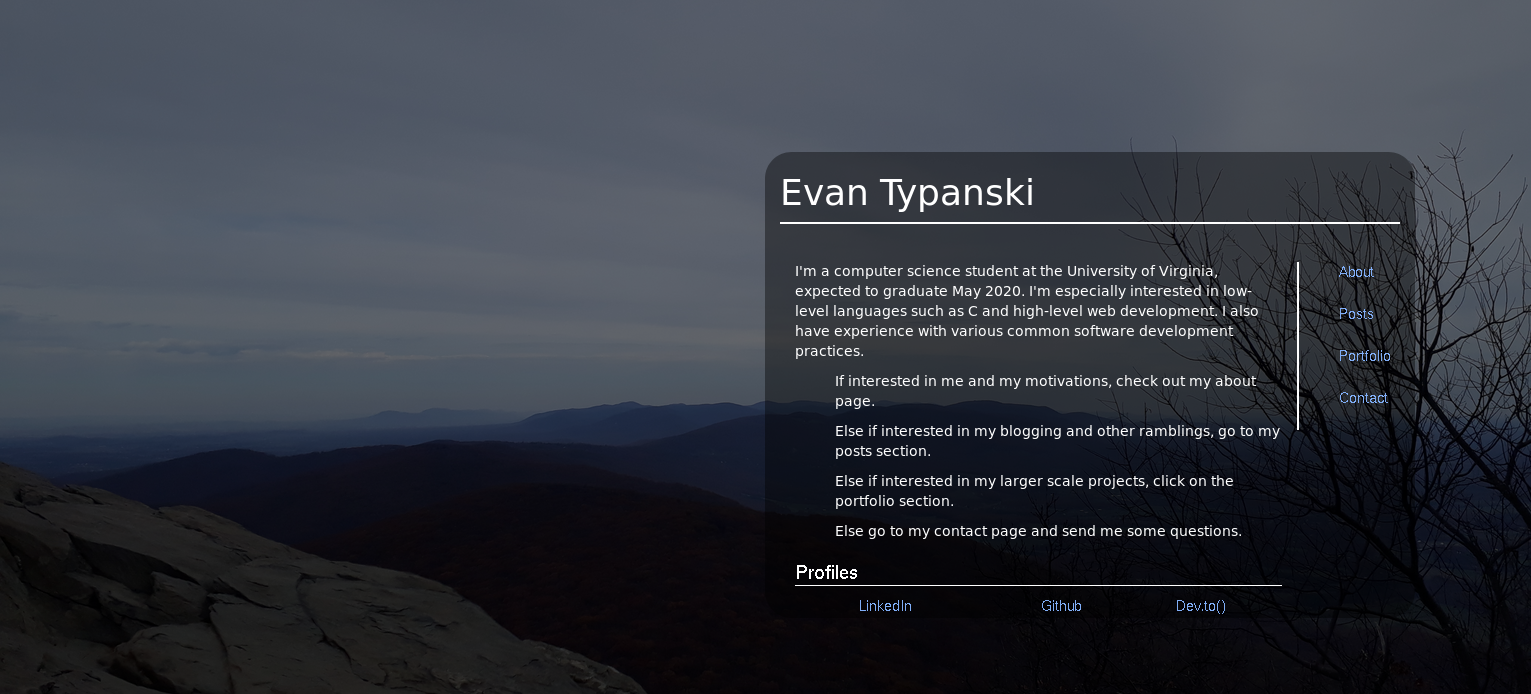
 Homepage of iteration 3 of my personal website:
 personal_site_3
I’m no expert, but your personal website shouldn’t just be for an employer. You shouldn’t just care about what an employer thinks if they see your website. I wouldn’t say go all out with an obnoxious pink background and unicorns everywhere, even if that is you. Just put less thought into how an employer would think and more thought into how your website helps you improve as a developer. Your growth and development through time is far more valuable than a safe site with your resume on it, and that’s worth keeping in mind.